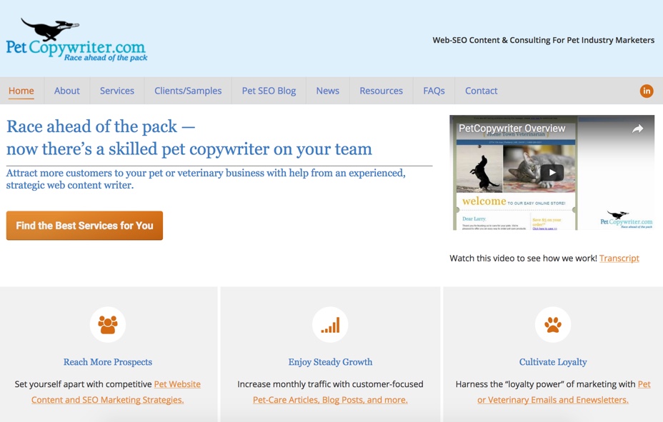

You may have noticed by now that PetCopywriter.com’s website design has been updated. Thanks to the wonderful skills of graphic designer Jason Spooner and web developer Neil P. Arnold, we’re thrilled with the results.
The reason we did this is… I didn’t feel the website was showcasing what we offer pet and veterinary companies in a quick and overt way.
I took a fresh look at the site from the visitor’s perspective, practicing what I preach in this blog. 🙂
I said to myself, “When someone arrives here, what should be the first impression they get in mere seconds?”
It’s simply this: You can race ahead of the pack and attract more customers with help from a skilled pet-industry copywriter.
So the web team reworked PetCopywriter.com’s home page with a clean and logical design, simple customer-benefit messages, a video introducing our services to potential clients, and clear invitations for visitors to explore our many services.
That’s it! Much better when it comes to clarity that helps visitors know what to find here. I hope you agree. (Please let me know.)
Having said that, if you scroll below the first screen, you’ll see more content about featured solutions and benefits. But if you choose not to scroll, you can quickly access specific sections of the site you’re interested in.
I’m telling you this because you may want to consider whether or not your pet or veterinary website solutions “pop” in a clear and inviting way for your prospects.
You could be missing opportunities with hundreds of potential customers, so it pays to take a hard look at your site.
Quite often, companies feel compelled to either cram too much information into their home page’s first screen, or include nothing but a gigantic, slow-loading photo.
Both of these approaches are less than ideal for your visitors. It forces them to either “hunt through the jungle of clutter” to find what they need, or they’re puzzled about what you offer because there isn’t enough information.
As I’ve discussed before, first impressions are EVERYTHING pet website success. People are not patient or willing to sniff out what they need. They want solutions. Now.
If they visit a website that’s too difficult to navigate, they’ll move on immediately. But if they find a website that meets their needs with a clear promise, “Enjoy [these benefits] with our solutions [you’re seeking]!” – they’ll stick around to learn more.
For example, a pet-carrier company may offer this type of clear message: “Help your best friend travel in comfy security with our super-snug pet travel carriers.” (I wove in the keyphrase “pet travel carriers” for SEO purposes.)
Therefore, I leave you with this recommendation. If you know your pet or veterinary website isn’t generating the traffic or sales it should… and you’re not sure why… ask for a professional web marketing audit. A few strategic content and layout changes could make a massive difference in your sales.
What website problems do you come across when searching for solutions? Please share!
Until next time,
Here’s to a profitable pet website.
Pam Foster
PetCopywriter.com